Taller Jacobo y María ángeles

Role:
Creative Director, UX Research, UX Strategy, UX Designer
Project leNgth:
6 Months
ABOUT PROJECT:
The Jacobo and Maria Angeles Workshop website is a project that aims to improve the online presence of the workshop, and increase its digital engagement with customers. The website started off as a simple idea to make it more interactive, but after conducting UX research, it was found that there were more needs that needed to be addressed to optimize the website’s potential.
PROJECT OBJECTIVE
Additionally, the client sought to use dynamic content as a tool to educate and attract outsiders to the workshop. This presented a unique challenge of creating an interactive and compelling tool while also respecting the integrity of the artisan’s work and artistry. The aim was to offer a glimpse into the process without revealing too much, with the ultimate goal of compelling viewers to visit the workshop in person.
UX RESEARCH
The UX research was conducted during Holy Week, where I surveyed and spoke to over 100 visitors from all over Mexico and internationally. This diverse group of visitors gave me a better understanding of the digital reach of our website and social media. Here I learned that even though a lot of Baby Boomers visited the workshop, most of our buyers were Millennials, but Centennials offered a new perspective that solidified the importance of having a digital experience with accessibility to buy online.
To create dynamic content on our website, the teams and I prioritized user-friendliness and easy navigation with clear calls to action and intuitive design. This involved optimizing the website for SEO to increase its discoverability by potential clients. There were several visitors who never visited the website online and also did not follow the social media channels. I collaborated with the web development and design teams to update their marketing strategy and engage their audience through their social media channels and newsletters. By fostering brand loyalty, the goals is to build relationships with their customers and drive traffic to their website.
CHALLENGES
The project also presented unique challenges related to working within a specific cultural context. I had to immerse myself in the culture and create genuine connections with the community in order to truly understand their needs and pain points. This also involved presenting research and data in Spanish, extending my capacity to work with them outside the project to create a genuine and trusting relationship and adapting to a culture that was not always open to outsiders.
Bandwidth accessibility also proved to be an issue, particularly in a small rural town in Oaxaca. We had to ensure that the website was optimized for low-bandwidth connections, while still providing an engaging and informative user experience.
USER PAIN POINTS
It seems as though there is an overwhelming amount of information on the website and the main objective of the workshop seems to get lost
It seems rather difficult to find the online store
There is not enough inventory or the inventory goes very fast
BUSINESS PAIN POINTS
They want to drive their consumer to their online store as much as possible
They do not have enough inventory to supply possible demand if the online store takes off
There is not enough traction on the website
PERSONAS

DAVID COLONIA – This persona represents the millennial demographic, which was found to be a majoral portion of our buyers during the UX research. David is a family man that like to travel with his family. He is a tech-savvy, pubic servant that lives in Mexico City and prefers a seamless digital experience. They value user-friendliness and easy navigation on websites, with clear calls to action. They are active on social media and appreciate engaging content. They are likely to research products online and make purchases through accessible online platforms.

SRA. LOURDES – This persona represents the baby boomer demographic. She is a retired woman of 65 years of age who loves being a grandmother. She loves taking day trips with her family that are related to arts and culture. She prefers having an in person experience and likes to see things before she buys. After establishing a trusting relationship with a brand, she has no problem ordering online if the experience is straight forward and user friendly. She is part of another significant group of buyers that was identified during the research. Baby boomers may not be as tech-savvy as millennials but still appreciate a user-friendly website with intuitive design. They value clear and concise information when making purchasing decisions.

ISIS MENDOZA – This persona represents the Centennial demographic. Isis is still too young to buy but offers a perspective for whats to come. She is part of a group whose importance was solidified during the research. They prioritize a digital experience with accessibility to buy online. They are highly tech-dependent and value websites that are optimized for SEO and easily discoverable. They are active on social media and appreciate engaging content that resonates with their interests and values. They are likely to make online purchases and may be more influenced by online reviews and recommendations.
SEO STRATEGY
Initially, the headers were not searchable as they were baked onto the main images. However, I proposed turning them into live text, which made the website more accessible to search engines.
Working closely with the marketing team, we identified key words and also developed new headers that were optimized for search engines. Despite initial reluctance from the client to use the mainstream word ‘alebrijes’, I made a case for its existing marketing value to boost the website’s visibility on Google searches.
Together, we updated every main landing page to ensure that they were optimized for search engines, and I provided the team with the knowledge to continue doing this independently after my time there. We were also strategic in rewriting translatable text and assigning them to the correct H format for maximum optimization.
This highlights the time and effort that went into updating the website’s SEO strategy, including translation updates and mobile versions in both English and Spanish. The result was a more accessible website that was optimized for search engines and able to compete more effectively with other similar websites.
MAIN LANDING PAGE
Before SEO Strategy

After SEO Strategy
ONLINE STORE LANDING
Before SEO Strategy

After SEO Strategy
DRIVING TRAFFIC TO ESHOP
Another component to this project as creative director was to drive more traffic to the online store and address the challenge of meeting the high demand for custom-made, hand-crafted pieces. By leveraging UX research, educating users about the unique value of the products, and integrating dynamic content, I successfully developed a comprehensive strategy to enhance the online store’s performance.
Extensive UX research was conducted to gain insights into user behavior and preferences. Through this research, it was discovered that a significant number of potential customers were unaware of the workshop’s offering of custom-made pieces. This knowledge gap became a focal point for the strategy development and posed a challenge because the product is handmade and cannot be mass-produced to meet high demand.
To tackle this issue, a sub-landing page was created under the online store dedicated to an online form for custom-made pieces. It was important to maintain the personalized experience that visitors have when visiting the gallery, so the user was not disconnected from this experience. To achieve this, the personalized experience was continued, but users were informed that the experience was also available online. The issue of high demand was addressed by educating the user that what they were paying for was a unique, carefully crafted hand-quality piece that took time to create and in some cases, part of the gallery exhibits before being shipped to their destination. This increased interest and demand for the product.
To further drive traffic to the online store, I implemented SEO updates by changing the headers to include keywords such as “alebrijes” and “lets us design your piece”. These keyword placements aimed to improve search engine rankings and ensure that the store would appear in relevant searches by potential customers.
Additionally, I added dynamic content on the header to captivate the audience and offer a window into the magic that is offered at the gallery in San Martin Tilcajete. This dynamic content, video snippets, offered users a captivating window into the enchanting experience that awaited them at the physical gallery.
Overall, the process for developing the online store strategy was driven by the need to drive more traffic to the online store while maintaining the personalized experience that visitors have when visiting the gallery. By creating a sub-landing page for custom-made pieces, educating users about the unique, carefully crafted pieces, and optimizing the online store for SEO, the strategy was successful in increasing traffic to the online store and promoting the workshop’s custom-made pieces.
WIREFRAMES FOR E-SHOP
Hand-Drawn Landing Page

Hand-Drawn Sub-Page

Digital Mock-Up of Landing
Digital Mock-Up of Sub-Landing
Finished Landing Page
Finished Sub-Landing
INITIAL SKETCH

INTERACTIVE LANDING
INTERACTIVE CONTENT
As the Creative Director, I had the privilege of overseeing the entire process, from ideation to execution, ensuring a seamless and captivating user experience.
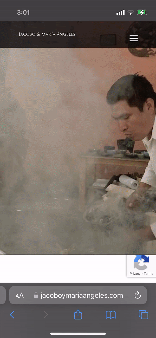
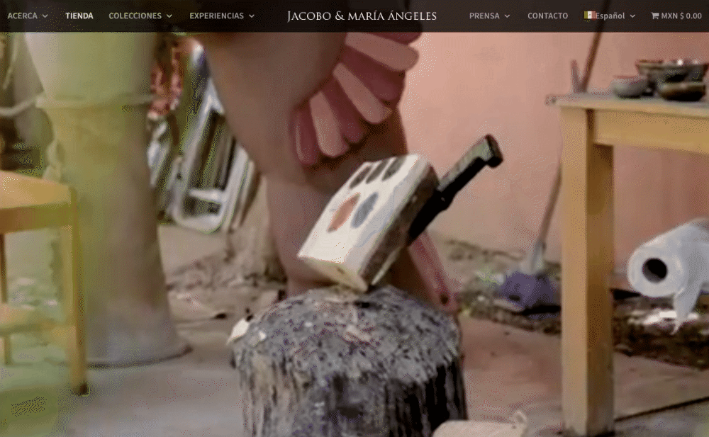
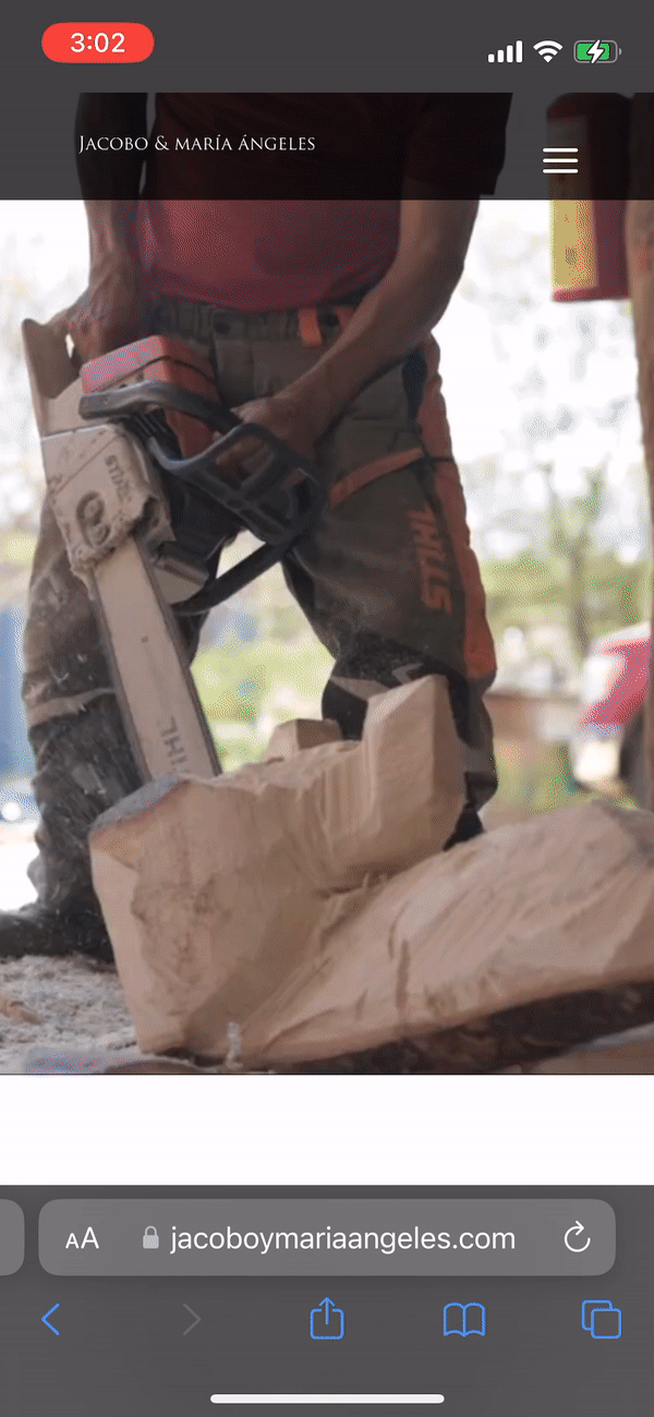
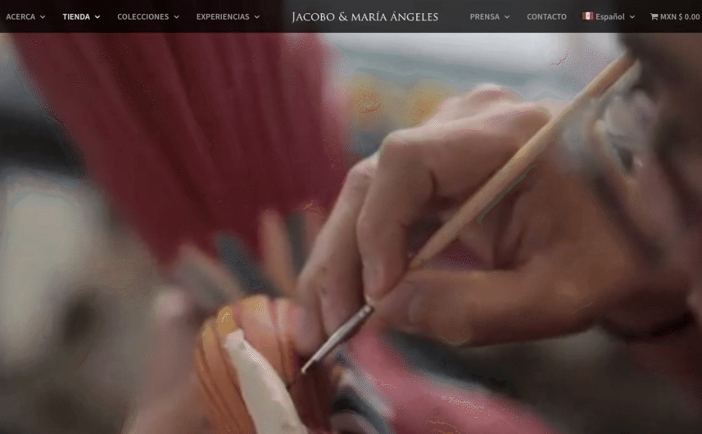
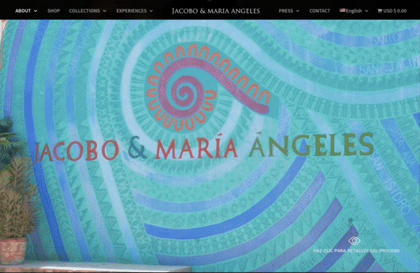
The journey begins right on the homepage, where users are greeted by a dynamic and engaging video clip that serves as the header. This concise video encapsulates the essence of the alebrije crafting process, offering a captivating summary that sparks curiosity and invites further exploration. By making the header clickable, we provide users with the opportunity to delve deeper into this fascinating world.
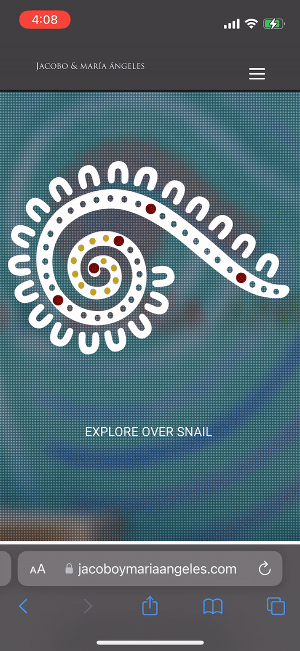
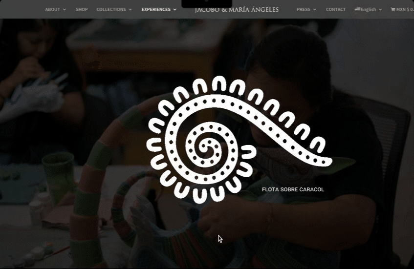
Upon clicking the video, users are seamlessly directed to a beautifully designed timeline, featuring the logo of our workshops—a snail. This innovative and visually appealing concept serves as a navigational tool for users to explore the various stages of the alebrije-making process. Each point on the snail represents a key stage of the alebrije-making process. By clicking on these points, you will unlock a series of short 10-15 second videos, each offering a tantalizing glimpse into a specific phase of creation.
The snail’s shell acts as a visual representation of the timeline, with five distinct points along its spiral. Each point represents a significant part of the crafting process. Users can click on these points, and they will be treated to a series of short 10-15 second videos, offering glimpses into each phase. These videos strike a delicate balance, providing enough information to pique curiosity and create a desire for more, without overwhelming the user.
The primary goal with this interactive content is to entice users to explore further, driving traffic to our online store and ultimately increasing online sales. It also aims to encourage visitors to experience the magic of the physical gallery by preserving the personal connection and unique workshop tour they offer, free of charge.
Through extensive UX research, I discovered that people are not only fascinated by the process of crafting alebrijes but are particularly intrigued by the idea of finding an alebrije that represents them personally. I took this valuable insight into account and engaged in discussions with the client to find a way to make this information easily accessible.
However, it became apparent that providing too much information about each tona and nahual and its symbolism could potentially dissuade users from visiting the workshop in person, as the client values the ongoing relationship with visitors. Leveraging this understanding, the teams and I strategically designed the dynamic content of this project to maintain the allure and magic of the in-person experience.
In close collaboration with the web development and multimedia production teams, I art directed the direction of the video footage, the content, and the overall design of the snail timeline concept. By working closely with these teams, we ensured that the interactive content seamlessly integrates into the digital platform while delivering an educational and captivating experience for users.
Usability Study – Findings
This usability study focused on improving the user experience of a landing page across different screen sizes and devices. The researchers found that moving the call to action to the center of the page allowed for easier adaptability to various screens. Additionally, they added more obvious visual cues for entering and exiting the content within the timeline, ensuring a seamless experience for both mobile and desktop users. Legibility of text on mobile devices was also prioritized, and a separate mobile experience was designed to accommodate screen sizes without the need for flipping the phone. To optimize performance, motion graphics and excess weight where adjusted to reduce download time. Finally, the study emphasized the importance of having sufficient contrast between the content and background to improve readability.
LEARNED EXPERIENCES, LIMITATIONS & CONCLUSION
However, it is important to note that there were certain limitations during the project. One of these limitations was the skill set required to integrate motion graphics. Due to this, the implementation of motion graphics was not as extensive as initially envisioned.
Additionally, time constraints were also a significant challenge throughout the workshop. With numerous projects and limited resources, there were instances where resources had to be diverted from this project. This resulted in a constant need to negotiate and manage time effectively, often requiring me to provide additional services to lighten the workload.
Despite these limitations, I am proud to present this project as it demonstrates my ability to envision and execute captivating interactive content. Throughout the process, I worked closely with various teams to ensure the client’s vision was met. By creating an educational component that resides within the Experiences category, we have enhanced the overall digital platform while respecting the client’s desires.
I invite you to explore and immerse yourself in the enchanting process of crafting alebrijes through this dynamic and engaging digital experience.